 Adam Patterson
Ever wish you could simply center a bootstrap column? Like an odd-numbered column? Grids are great, Look at all that order that they provide!
I have been using them for years, but there are always certain instances where the grid fails, and you begin to lose the practicality of the grid.
For instance. If you had a 9 column grid and you need a 7 column wide centered row, no issues! Offset by one. But what if you had a 9 column grid and needed to center an 8 column row?
Make your own class and move on.
Oh wait, What about responsive layouts?
I guess we are on our own with this and we just lost predictability without layout.
Following how Bootstrap generates their scaffolding I set out to create an easier way of dealing with centering structured grids, So enjoy!
Load this as part of your Bootstrap mixins.less make sure to also compile the responsive.less if needed.
Adds centered columns.
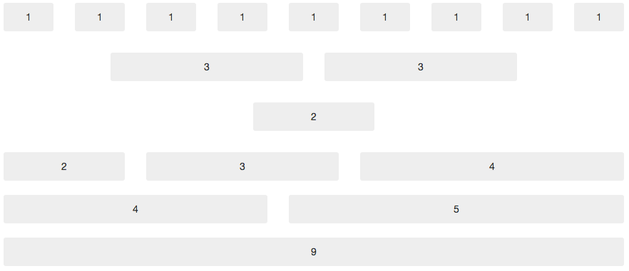
<div class="row">
  <div class="center6">
        <div class="span3">3</div>
        <div class="span3">3</div>
    </div>
</div>
.makeCenterColumn(@columns) {
// Prevent columns from collapsing when empty
min-height: 1px;
width: (@gridColumnWidth * @columns) + (@gridGutterWidth * (@columns - 1) + @gridGutterWidth);
margin: 0 auto;
// Proper box-model (padding doesn't add to width)
.box-sizing(border-box);
.clearfix();
}
#grid {
.center (@gridColumnWidth, @gridGutterWidth) {
.centerX (@index) when (@index > 0) {
.center@{index} { .center(@index); }
.centerX(@index - 1);
}
.centerX (0) {}
.center (@columns) {
// Prevent columns from collapsing when empty
min-height: 1px;
width: (@gridColumnWidth * @columns) + (@gridGutterWidth * (@columns - 1) + @gridGutterWidth);
margin: 0 auto;
// Proper box-model (padding doesn't add to width)
.box-sizing(border-box);
.clearfix();
}
.centerX (@gridColumns);
}
}
#grid > .center(@gridColumnWidth, @gridGutterWidth);
@media (min-width: 768px) and (max-width: 979px) {
#grid > .center(@gridColumnWidth768, @gridGutterWidth768);
}
@media (min-width: 1200px) {
#grid > .center(@gridColumnWidth1200, @gridGutterWidth1200);
}
@media (max-width: 767px) {
[class*="center"] {
float: none;
display: block;
width: 100%;
margin-left: 0;
.box-sizing(border-box);
}
}